


Card interaction style changes the common tap path without changing what the provider device can do.
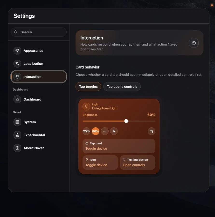
Choose a card behavior
Open Settings → Interaction, then choose:
- Tap toggles for a fast common action on supported cards.
- Tap opens controls when you prefer to inspect the control dialog first.
Settings buttons and secondary card actions remain available in both modes.
Identify an entity
Open an entity card’s controls or settings dialog. In dialogs with a three-dot More actions
menu, the Entity id appears at the bottom of that menu. Other dialogs display it beneath the
name and type. This is the provider’s native ID, such as sensor.office_temperature in
Home Assistant. Use it to distinguish entities with similar names before renaming or moving
them. You can select the ID text to copy it.
Choose a safe household default
Control-first is useful on shared screens where accidental actions are more costly. Toggle-first is useful for familiar lighting and switch controls.
Locks, alarms, and other risky actions keep their own confirmation behavior rather than inheriting an unsafe one-tap path.
This is an account preference when profile synchronization is available. It is separate from the device-setting groups used for kiosk mode, visual quality, and layout.
Limit browser zoom on this device
In Settings → Interaction → Browser zoom, choose Allow zoom to keep the browser’s normal zoom controls. If a text field causes unwanted zoom when you focus it, choose Limit zoom for this device. The browser may limit automatic zoom, but some browsers ignore the setting.
Limiting browser zoom can also prevent pinch zoom, making small text harder to read. Turn the setting back to Allow zoom to restore the browser’s normal zoom behavior.